Data visualization is the process of presenting data in a creative and visually appealing manner. It is a crucial aspect of data analytics because it makes data more accessible and understandable. In today’s digital age, data visualization has become extremely important. Gathering data is not enough; analyzing and presenting data effectively is just as important. As data visualization continues to gain importance in various industries, a career path focused on data visualization emerges as a lucrative option.
In this blog, we will discuss the in-demand skills for data visualization jobs and how aspiring professionals and students can develop these skills.
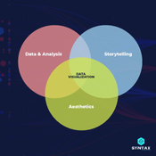
Identify the key principles of Data Visualization and how they are used in data analysis
Data visualization is the practice of transforming data into visuals that help uncover patterns, trends and stories. The key principles for effective data visualization include accuracy, organization, clarity, simplicity, visual hierarchy, balance and proportionality. Accurate data presentation is essential in order to effectively analyze insights from the data.
Organization refers to creating an efficient structure to present data that allows for easy exploration and analysis. Clarity is essential to understand the context and focus of each chart while simplicity means presenting only necessary information in a precise manner.

Visual hierarchy assists readers better understand complex data by organizing it more effectively, while balance and proportionality help create aesthetically pleasing visuals, which can also make reading easier.
Articles you may like:
Data Visualization Examples: Good, Bad and Misleading?
Top Data Analyst Skills You Need to Know?
How to Get into Data Analytics?
Knowledge of Programming Languages: Working Experience with Python, Java, or C++
Having a strong command of programming language is essential for any type of data visualization job. Knowing how to work with Python, Java, and C++ can help you visualize data and create sophisticated visualizations that bring insight into the data.
Working experience with these languages allows you to quickly manipulate large datasets and develop robust analytical models. Knowing the syntax and capabilities of the language allows you to write efficient code that can be used by data analyst for data analysis, reporting and other needs.
Furthermore, a programming background gives you access to more sophisticated libraries and packages that can help generate even more powerful visualizations.
Familiarize yourself with popular Data Visualizations Tools such as Tableau, Microsoft Power BI, and R Studio
Getting familiar with popular data visualization tools is a critical component for any aspiring professional the field of data visualization. Tableau, Microsoft Power BI and R Studio are three of the most commonly used tools by data analysts for data visualization.
Tableau is a powerful tool for visualizing complex datasets in an intuitive manner. It allows users to quickly explore and analyze data, as well as produce stunning visualizations.
Microsoft Power BI is a suite of analytics tools that enable users to create interactive visualizations and dashboards from their data.
R Studio provides an integrated development environment for the popular language R, which is used by many statisticians and researchers across the world.
Develop your storytelling skills to better convey your insights from data to stakeholders
Storytelling is an important skill for data visualizers to effectively communicate the insights they uncover from their data. The challenge is to show complex information in a way that stakeholders understand and take action on. To do this, it is necessary to craft stories with compelling visuals.
Stories should be tailored to the intended audience, whether it be executive management, regulators, or the general public. Presenting data in an accessible way that conveys the right message is critical for effective storytelling. The use of visuals can help simplify complex concepts and make them understandable to stakeholders.
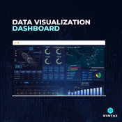
Learn how to create effective dashboards that deliver both actionable insights and easily digestible information
Dashboards are a great way to present data in a concise and interactive manner. They can provide stakeholders with actionable insights that can be used to make better informed decisions. Effective dashboards should have an easy to understand design and be intuitively laid out so users can quickly identify the information they need.
Data-driven visuals such as graphs, charts and maps can help users easily digest the data. When designing a dashboard, it is important to consider how different elements should work together, as well as how to best use colour, font and other visual elements.
A good dashboard should be able to effectively communicate the data in an efficient manner and provide actionable insights that drive decision-making.
Creative Problem Solving Skills
Creative problem solving skills are essential for any data visualization professional. In order to uncover insights from data and effectively present them, one must be able to think outside the box and find innovative solutions.
Problem solving involves breaking down complex issues into smaller components in order to evaluate all possible outcomes. This requires the ability to analyze a variety of sources and come up with creative solutions.
Conclusion
In conclusion, data visualization is an important and growing field that requires specialized skills to effectively present complex information. Data scientists must be adept at programming, storytelling, making effective dashboards and problem solving.
With the right knowledge and skill set, it is possible to unlock the potential of data to deliver meaningful insights for stakeholders. With the right resources and continued practice, data visualization professionals can hone their skills to become successful in the field.
We, at Syntax Technologies, help you hone your data Visualization Skills through our coveted Data Analytics course. Join today!