The effectiveness of data visualization can be gauged by its simplicity, relevancy, and its ability to hold the users hand during their data discovery journey – Jagat Saikia
Are you someone who gets very jittery in the sight of a slew of numbers? I am sure many of you are. Numerical statistics can appear to be really daunting especially if you do not possess enough knowledge about a specific domain.
This is where Data Visualizations come to our rescue. In the words of Charles Miglietti, co-founder of Toucan Toco, Data visualization is the art of depicting data in a fun and creative way, beyond the possibilities of Excel tables. In a way, it’s like setting figures to music.
Data Visualization combines graphic designing, storytelling as well as analytical skills in order to present data in visually appealing and comprehensible forms.
Its usage is not restricted to the business sphere alone and is widely used for public health visualizations, for depicting political and pop cultural trends and so on. It is evident that Interactive Data Visualization Examples can be drawn from all kinds of societal pockets.
Moreover, within the business sphere, a Good Data Visualization Example is reflective of optimum utilization of Business Intelligence Reporting. The data presented in such visualizations can effectively guide business decisions.
If you wish to read more on the subject of Business Intelligence Reporting, do read our blog on Everything You Need to Know about Business Intelligence Reporting
In this blog, we shall look at some of the Best Data Visualization Examples. These Data Visualization Examples are sought to be drawn from diverse sectors of society and are not solely related to the business sphere. At the same time, we shall also look at Good and Bad Data Visualization Examples, along with Misleading Data Visualization Examples.
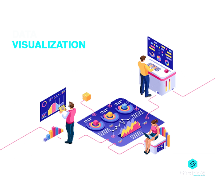
What is Data Visualization?
Data Visualization can be seen as a powerful communication tool which helps in Data Analysis through transforming raw data points and numerical figures into aesthetically appealing visual representations.
It helps in presenting complex information in a logical, simple, comprehensible and interactive form. Thus, Interactive Visualization is also a form of organizing data in compelling and digestible forms.
There are numerous tools available in the market which can help vizualize data in a simple way. Tableau and Power BI happens to be two of the foremost BI Reporting Tool of choice.
If you wish to read more on the debate between these two prominent tools, do read our blog on Power BI vs. Tableau: A Detailed Analysis
Examples of Data Visualization: Different Approaches
In this section, we shall look at some of the different ways or forms in which data can be represented as a part of Data Visualization.
- Line Chart: Usually used to depict trends
- Scatter Chart: Used to highlight the values of two different variables as points on a chart
- Bar Chart: Usually used for comparing categories and groups
- Area Chart: This is quite similar to a line chart; the only difference being that the area below the line is filled with a certain color
- Indicator: Used to indicate the direction of movement of entities
- Bullet Graph: Similar to Bar Chart
- Map: Used to indicate geographical distribution of data
- Matrix: Used to highlight relationship between multiples variables and data points
- Pivot Table: Useful in summarizing large amounts of data, while at the same time highlighting the critical information. Each cell in the table represents a unique data point.
- Box Plot: Useful for highlighting distribution of data
Data Visualization Examples
As already stated, the art of Data Visualization is not utilized within the sphere of business alone. Using it to depict data which concern business enterprises is just one of the myriad uses of Data Visualization.
In this section of the blog, we shall look at five compelling Data Visualization Examples from different arenas.
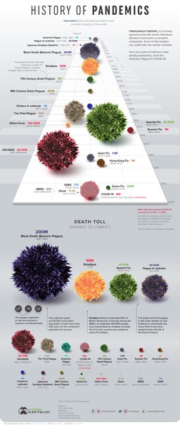
- History of Pandemics
The graphic depicted below is an informative piece of visualization by Nicholas LePan. Within a single image, he has sought to convey a powerful narrative: the trajectory of known pandemics in the history of humankind.
It also includes other details like the name of the pandemic, the approximate date as well as the official death toll. Some of these diseases can be seen to be incrementally increasing with the rising population while this particular piece of Data Visualization also compares the different pandemics on the basis of the number of deaths which resulted from it.

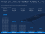
- Water Pollution through Plastic Disposal
Plastic is considered to be quite a notorious source of water pollution. Its non-biodegradable nature poses tremendous dangers to marine flora and fauna.
Through this particular piece of Data Visualization which was actually a part of the larger project by Jamie Kettle, he sought to compare some of the world’s largest bodies in terms of the extent to which their water is contaminated with plastic.
The infographic provides some eye opening data indicating huge volumes of plastic which make their way to the different water bodies.

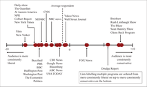
- Ideological Positioning of Media Outlets on the Political Spectrum
The given Data Visualization technique uses a distribution plot in order to indicate the placement of each of the media outlet on a given ideological continuum.
The media outlets positioned on the left side of the spectrum tend to be those who derive their chunk of audience who happen to be consistently liberal; while those positioned on the right side of the spectrum tend to be those who derive their chunk of audience who happen to be consistently conservative.

- Data Visualization Examples from Daily Life
This particular signals visualization is one of the most common and yet one of the most effective forms of Data Visualization from our daily lives.
For instance, one of the most common ways for measuring Wi-Fi signal strength is in decibels per milliwatt (dBm).
However, if we are presented with certain numbers using this unit, we will not really be able to understand if it indicates a good network strength or a bad one.
In order to simplify this confusion, data visualization in the form of line bars are used. This is also true for the bars which indicate the battery status.


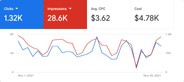
- Business Analytics
This is one of the most useful Data Visualization Examples from within the business sphere. The image depicts a sample Data Visualization page for all the campaigns currently in operation on Google Ads for a particular business organization.
It shows data for the month of November, 2021. Such a visual representation about the performance of the campaigns is extremely helpful for marketers who are able to understand the feasibility or otherwise of particular marketing efforts.

Good Data Visualization Examples: Best Practices
In the above section, we looked at some striking Examples of Data Visualization. However, Data Visualization is not simply a haphazard way of representing numerical data facts.
It is an art of storytelling in a form which is easily understandable. Thus, it is important to look at some of the DOs while deciding upon a particular form of Data Visualization.
- Choose the most Appropriate Medium for Data Visualization depending upon the Objective it is meant to serve
- Provide necessary Context around Visuals
- Ensure Simplicity and Clarity of Information
- Where possible, bring in Originality by relating, seemingly Unrelated data and subjects
- Ensure Brevity and Avoid Unnecessary Information
- Use Simple and Easy to Understand Color Palettes
- Pay attention to Graphics in order to make sure that they are Visually Appealing
Examples of Bad Data Visualization: Mistakes to Avoid
After we have looked at some of the criteria which are a part and parcel of Good Data Visualization Examples; we shall consider some of the pitfalls which should be avoided while producing a Data Visualization piece.
- Avoid using Too Many Variables within a single image which might result in distracting the viewers
- Be extremely careful of not visualizing data through an Unsuitable or Incorrect visualization format
- While using Scales in Data Visualization in order to depict differences between data points, it is important to ensure that the Scale is not Inconsistent
- Poor Choice of Colors is another significant issue which should be avoided at all costs. Thus, it is important to:
- Avoid using colors with negligible contrast
- Avoid using too many colors
- Avoid using conventional colors to convey opposite meanings
- Pay heed to the needs of people who might be colorblind
Bad Data Visualization Examples
In the section above, we have identified some common mistakes which if made, would result in bad Data Visualizations. In this section, we shall look at some of the Examples of Bad Data Visualizations.
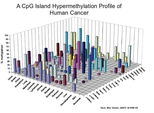
- Example 1:
In this first example, we have taken the case of a 3D Model which is presented for the purpose of Data Visualization.
Firstly, the graph involves too many variables which makes it difficult for the viewer to comprehend it immediately. Secondly, the 3D design has resulted in undue complexity wherein some bars are simply seemed to be hidden behind those in the front.
It makes the information more and more difficult to understand and is certainly one of the clear cases of Bad Data Visualizations.

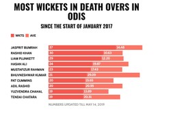
- Example 2:
The below image is one of the clear Examples of Bad Data Visualization. This time the problem is with the color chosen for the depicting the wickets and the average.
As it can be seen that both the entities have been depicted by different shades of red and since they are incorporated within the same bar, it becomes difficult to differentiate between the two.

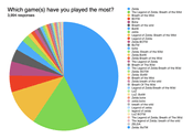
- Example 3:
This piece of Data Visualization is a kind of survey data which tries to grasp the popularity of a particular game on the basis of which one is the most played. However, the visualization is beset with two kinds of problems.
Firstly, it involves far too many variables which make it complex.
Secondly, the different colors used are not easily differentiable from each other and thus it becomes difficult for the viewers to really make out the area spanned by each of the game.

The above list of Bad Data Visualization Examples is definitely by no means exhaustive. There are numerous other cases which result in a bad visualization and hence it is important to be cautious of the factors which go into making a decent Data Visualization.
Misleading Data Visualization Examples
Data Visualization Examples are instances of efforts made by someone to convey a specific message to the audience.
However, when the visualization itself is distorted or manipulated (intentionally or unintentionally), it results in Misleading Data Visualizations. This can be regarded as disingenuous as well as an attempt to betray the public.
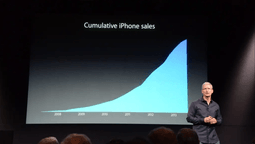
- Example 1:
This is one of the classic Misleading Data Visualization Examples wherein cumulative instead of annual data is used in order to give a sense of a continuous increase.
In 2013, Apple was criticized for the same blunder when Tim Cook used the particular chart to showcase the rising sale of iPads between the years 2008-2013.
However, the chart did not have any scale which means that the viewer will be unable to understand whether it depicted billion of iPads or thousands or hundreds.
Moreover, the chart simply showed cumulative data instead of the annual data which would in fact have revealed a far truer picture.

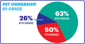
Example 2:
The choice of right chart or graph is an extremely important component of producing Good Data Visualizations.
In this case, we see the way in which the choice of a pie chart was definitely a poor one. Pie charts show parts of a whole wherein the value of the whole adds up to 100%. This is fundamental mathematical knowledge.
However, the sum of the parts presented in the image below adds up to 139%, which is technically absurd to be presented through a pie chart.

Example 3:
This is yet another extremely common Misleading Data Visualization Examples. It involves the manipulation of the y-axis through the omission of the baseline.
Baseline refers to 0 on the vertical scale. However, when the y-axis begins from any arbitrary number, it only results in exaggerating the difference between two data points, more than it actually is.
In the image below, a glance would give an impression that an overwhelming large number of Democrats supported the decision of the court than the Republicans.
However, the difference is not really so much (Democrats 62% vs. Republicans 54%) and it is only made to appear more by beginning the graph from 50% which is referred to as truncating the graph.


Conclusion
It is evident that Data Visualization Examples can be derived from every walk of human life. The urge to present data in simple, comprehensible and yet appealing forms, have only accelerated the demand for good Data Visualization.
At the same time, it is important to be aware of Misleading or Bad Examples of Data Visualization. Misleading Data Visualization Examples are particularly alarming in terms of manipulating the public conscience.
Hence, one should definitely pay attention to the factors which make up the case of Good Data Visualization Examples.
Data Visualization is an intrinsic aspect of Data Analytics and Business Intelligence. Analyzing data is of no use if one is not able to present the same in understandable forms to their respective stakeholders.
We, at Syntax Technologies, provide you with an amazing opportunity to develop hands-on experience in the usage of the most prominent Data Visualization tools as a part of our Data Analytics and Business Intelligence course curriculum. Read more here: